Well, don't fear!! I am hear to help you navigate your way through designing your own templete!! By learning simple design theories you can make your own projects with Heritage Makers beautiful artwork and backgrounds. I thought I would walk you through some basic design principles that can be used on your layouts, cards, and anything else you decide to create!!
I am a paper scrapper by heart and have been for 10 yrs now and love it! I am also a scrapbook teacher for EK Success and teach their SDU classes.This class is perfect for any beginner or more advanced scrapper who wants to learn the basics and refine their skills. Digital or paper, design is all the same!! SO let's begin!!
NOTE: When I talk about page, I mean whatever medium you are creating whether it be a digital page, a card, a page for a book.
COLOR
Color sets the mood of a page. There is no right or wrong, it's your preference! Warm colors like RED, ORANGE, YELLOW, are stimulating! While cool colors like BLUE, PURPLE, GREEN are soothing colors. When you combine cool colors with warm on a page, you create movement and excitement!
Your color palette and theme of your page should match. If you were making a beach page, you wouldn't use purple, pink and yellow! You would use blues, and greens and browns as your primary color choices, then add say pink ( to match the bathing suit as an accent color).
Color Dominance is when one color sticks out, while the other colors recede. As a general rule, most cool colors recede while warm colors dominate. Cool colors make great background colors. They blend in the background and give your eye a place to rest. Warm colors pop off the page and therefore are great as photo mats and accent colors!
You don't have to pick warm and cool colors for your page! When using just a cool color palette, your lightest and brightest colors will pop off the page. The only exception to this rule is when you ae using a Monochromatic color scheme ( 1 color, color scheme) The color used in the smallest amounts will be the contrasting color and will dominate the page. So potentially a light or dark color could be the dominate color.
You can create a focal point on your page with color! The focal point of a page is usually a photo and using dominant colors your reader's eye will graviate towards that color and focal point. Continue the dominant color throughout the page as it will allow the reader's eye to go from one side to the other.
Try and stick with a 3 color palette when designing your page. As a rule your darker color will be a great background color as it recedes. The lightest or warmest color would be your accent color as it tends to pop off the page. Your third color choice would be your supporting color which helps unify your design. But there are always exceptions!! Take for instance if you are using bight primary colors as your secondary and accent color choices, I would use a neutral color like black or white to give your eye a place to rest. Contrary to popular belief, brown and beige is Not a true neutral but can be used as a neutral..Take this page for example..

We have some awesome digital designers who create whole collections for the Studio! All of the elements in a particular collection all coordinate and go together beautifully! Now that you have learned about basic color concepts, I want you to think outside of your box and think patterns and colors!! The most AWESOME part of Studio is that you don't ahve to stick with one collection!! You can mix and match backgrounds and elements to create something that it totally YOU!!
Patterns and color
I want to talk now about pattern and colors. In digital design, especially with all of the papers and artwork that is in The Studio your options go on forever especially if you are in the Premier Club! My general rule of thumb for patterns and colors goes like this. First choose your color palette. I choose a few patterns in each color and keep the pattern in the same proportion as the others. If you want more drama then choose 1 big pattern and the smaller patterns will be your secondary colors. I generally choose a solid or almost solid as a background so your eye has a place to rest. I usually choose my solid color first then my secondary and accent. When I design in Studio I open collections that look appealing and drag a bunch of papers up to my project. You can always make them smaller so you can see what you have. After I "shop" I then play with the selections and see placement and shapes of the papers.
Here is another great example of a paper LO I did :

Design Elements
Line is one of the simplest design elements and I think one of the easiest to use. Line can be used in different ways to stengthen your layout, organize it and create movement.
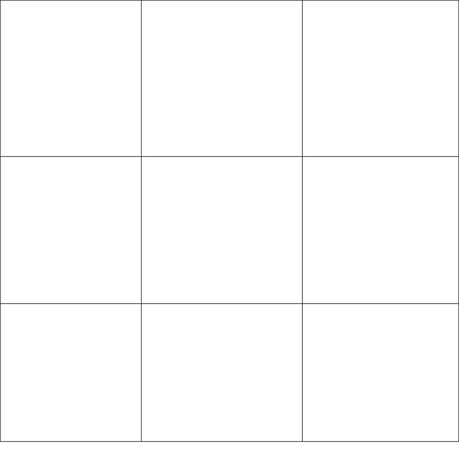
what do I mean by Organize with Line? By using a simple grid like the one shown here
Line can strengthen yor layout . What you choose ie. a thin line, wavy, dotted and what you use to make your line is totally up to you! Examples of using line to strengthen is aseasy as a line of photos across the page. A wavy line you intertwine with flowers, a dotted line using small circles..the choice is up to you. The advantage of Heritage Makers Studio is that your options are endless!
By creating movement with line you move the reader's eye across the page section by section. Line can connect realted things together giving it a cohesive look. It can also divide unrelated ones. An example would be if you placed 3 circles randomly on a page with a title and journaling. Now all these elements are not touching. To the eye, they look like they are just splattered on the page. But if you placed lines 2 lines horizontal and 2 vertical, it would allow the eye to flow across the page. Now it doesn't necessarily have to be "lines" you could use digital brushes of swirls, lines of beads, vines..
Other Important Notes about Design..
Keep your photos in proportion to one another! When cropping, if you decide to crop, dont decide to keep 2 photos 5x7 and crop 3 2x2. Also remember your spacing in between photos. Don't place 2 photos close together and have the other 3 with a 2" gap! It will look out of proportion!
Cropping photos in Studio is a breeze. If you are using a templete, just drop the photo in! You can adjust the placement of the photo after you drop it in simply by clicking on tools in your toolbox and click adjust. Make your adjustment and click done!! It's that simple!!
If you are creating from scratch it's still easy!! In the tool box click on crop and adjust the blue lines to where you want them. Click done. Click on the picture again and you will see green lines. Move them in and out to make image smaller or larger! Be careful!! The lines will turn yellow which means warning going too far, orange and red mean nope, go back!! LOL Once you go past yellow the pictures will come out fuzzy becasue they have been over pixalated. Be careful about pictures from a secondary source ie..facebook. You will not be able ot make them as large as normal photos because you are getting them from a secondary source and they were uploaded to a smaller dimension.
Do you want to know more???
In my next segment I will be teaching you about Design Structure, Object Placement and Journaling your story!!
No comments:
Post a Comment